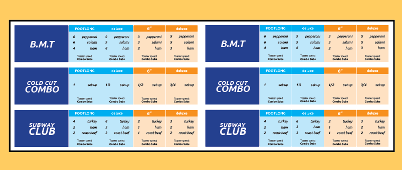
As a past Subway employee my biggest problem had always been the frustrating formula card. It was cluttered and confusing to read especially when under the pressure of a waiting customer. By creating hierarchy with type size and contrast I was able to make the names easier to find. Color coding was used to divide the footlong portions from the 6” portions. Spacing also played a big role in this project, allowing for breathing room the original did not have.